SARAH EDWARDS
Projects
Rock Music
The Diner
Get Connected
ONE MORE TUNE
PARALLAX
Marketing & Media
TETANUS
Writing
ABOUT
CV
Contact
Sarah Edwards
SARAH EDWARDS
Projects
Rock Music
The Diner
Get Connected
ONE MORE TUNE
PARALLAX
Marketing & Media
TETANUS
Writing
ABOUT
CV
Contact
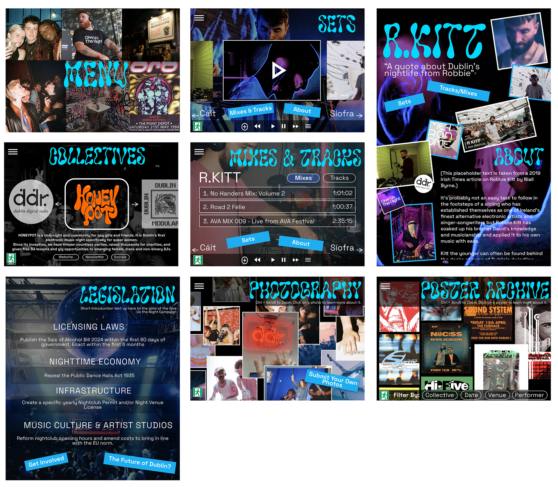
ONE MORE TUNE
ABOUT
One More Tune was conceptualized as an interactive documentary on the nightlife in Dublin, and the legal restrictions that threaten its existence. The project was a collaboration with Emma Murphy, Qin Cai, and Shiwei Tang.
↑
Back to Top